Quikserv Inc., a leading manufacturer of drive-thru transaction windows, pass-through systems, and security solutions, has been serving industries like quick-service restaurants, retail, healthcare, and commercial sectors for over 40 years. In early 2026, coinciding with their 40th anniversary, Quikserv undertook a comprehensive redesign of their homepage (www.quikserv.com).
The new version went live end ofJanuary, 2026. This case study explores the redesign process, focusing on the challenges and opportunities, goals, design execution, and measurable impact.
The opportunity arose from Quikserv's milestone 40th anniversary, which provided a thematic hook to refresh the brand's online presence. With the rise of e-commerce in B2B manufacturing and increased competition from digital-native competitors, there was a chance to reposition Quikserv as an innovative leader.
Market research indicated that potential clients in the quick-service restaurant (QSR) and pharmacy sectors were seeking suppliers with user-friendly websites that emphasized customization, security, and quick access to stock items. The redesign could leverage this by transforming the homepage into a dynamic gateway that not only showcased products but also built trust through storytelling and visual appeal.
The process spanned three months, from October 2025 to January 2026, involving user testing, wireframing, and iterative feedback.
User Research and Initial audits revealed pain points like cluttered product listings and outdated imagery. User personas were developed for architects, QSR managers, and procurement specialists. Competitor analysis (e.g., sites from Armortex and CRL) inspired a clean, industrial aesthetic with a color scheme of stainless steel grays, bold blues, and accents of red for CTAs.
Key Design Elements:

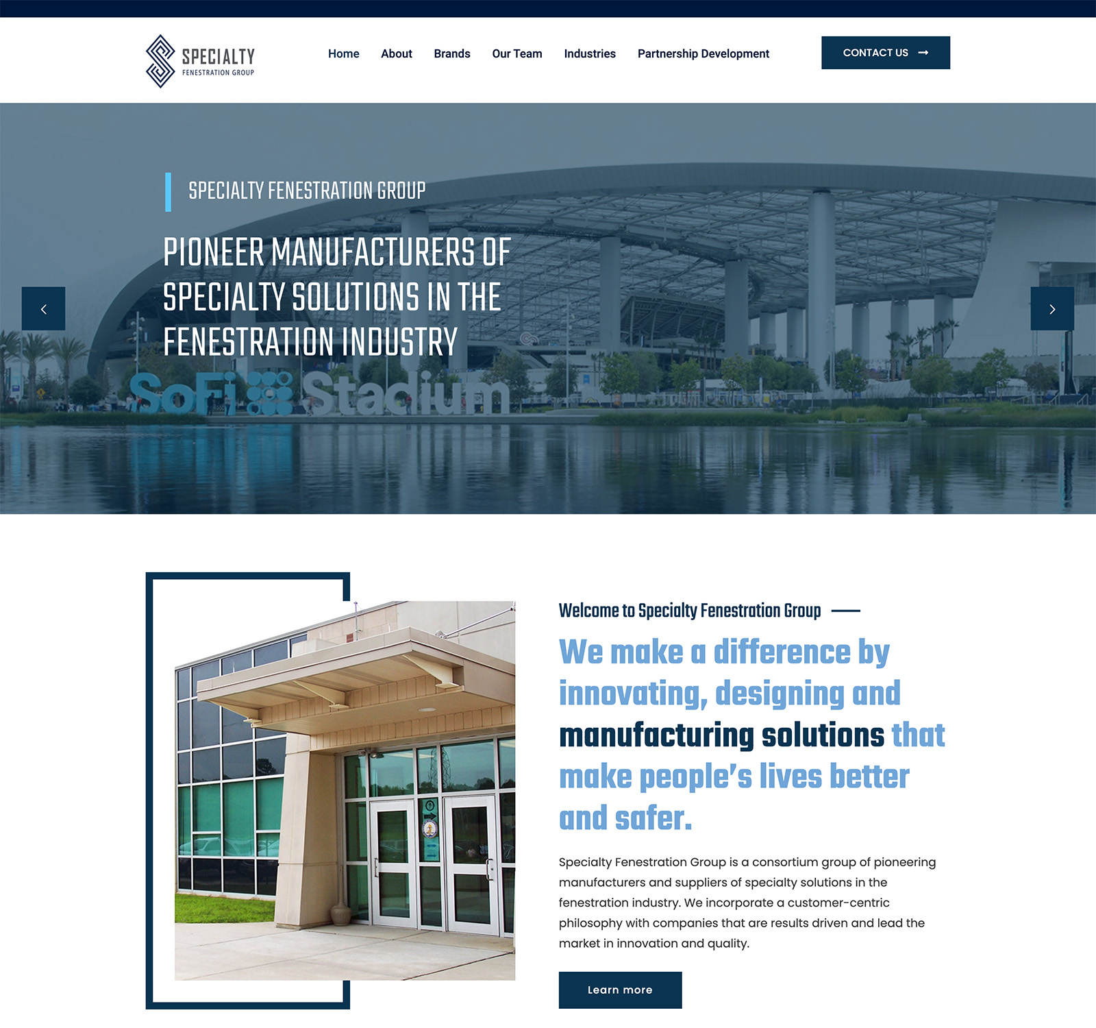
Hero Section: Replaced a static banner with a looping video showcasing transaction windows in action, overlaid with the 40th anniversary logo and tagline: "40 Years of Innovation in Transaction Systems." Dual CTAs - "Shop Our Stock" and "View Products" were added for immediate engagement.

Navigation and Layout: A streamlined mega-menu was implemented, categorizing products into Windows, Security, Drawers, and Accessories. The vertical scroll layout was optimized with lazy-loading images to improve performance, reducing page load time from 5 seconds to under 2 seconds.

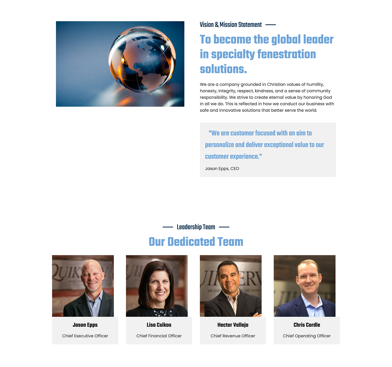
Content Sections: A new "Our Products" overview used high-resolution images and concise descriptions to highlight custom fabrication capabilities. A "Latest News" feed was integrated, starting with anniversary announcements, to keep content fresh. A client gallery featured logos from major partners like McDonald's, Walmart, and Texas A&M, with hover effects for interactivity.

Visual and Interactive Features: Incorporated responsive galleries with 150x150 thumbnails of installations (e.g., SoFi Stadium). Accessibility improvements included alt text for all images, high-contrast text, and keyboard navigation.
Key features delivered included:
Homepage focused on:
Lead UX designer responsible for strategy, research, IA, wireframes, and the unified design system. I was also lead developer building out the site in Wordpress to ensure:
This project was more than a website redesign — it was a strategic transformation of how SFG presents itself to the world. By unifying the brands under a cohesive digital experience, we strengthened their market position and created a scalable platform for future innovation.
I began with low-fidelity wireframes to establish structure, hierarchy, and user flow without distraction. These sketches helped align stakeholders early and validate content priorities. From there, I evolved the designs into high-fidelity prototypes — layering in brand identity, refined typography, and visual polish to communicate trust, innovation, and scalability across the consortium’s digital presence.
![[interface] interface of ai tool (for an ai saas company)](https://cdn.prod.website-files.com/695d74367bcd262c5cbfed6a/697a7feea3d82bd098c044ad_sfg_sketch_final.png)
![[background image] image of contact office (for a general contractor)](https://cdn.prod.website-files.com/695d74367bcd262c5cbfed6a/697a89eb5576ce5474270f4e_sfg_sketch_about.png)
COMPANY feedback

“Richard was instrumental in transforming our fragmented digital presence into a unified, modern experience. He quickly understood the complexity of bringing multiple brands together and delivered a clear, scalable UX strategy that elevated how we present ourselves as a group. His ability to simplify technical products into an intuitive, credible user journey made a huge impact. The final result finally reflects the strength and professionalism of our organization.”

![[background image] image of a tech office setting (for an ai developer tools)](https://cdn.prod.website-files.com/695d74367bcd262c5cbfed6a/6972bc333050067b876bf883_case_study_hero_1216x681.jpg)